Process visualization can save your project – start drawing today!
You have an idea for an awesome new customer journey, take some basic notes and get to work straight away. Then, while building it you realize there’s an issue or even more than one and it suddenly doesn’t work anymore as you sketched it out! One all too likely reason is that you didn’t make the effort of visualizing the process to get a complete picture of it. Lucky you if you came across the problems before the process went live and things turn ugly in the face of your customers.
To avoid this sort of trouble you should make process visualization a central part of your creative routine when developing new ideas. It makes it a lot easier to find dependencies, possible flow gaps and which data points you need to make things happen as you want. Ever forgot to tell your IT team that you really need a functionality or data extract by a certain date? Make this a thing of the past.
5 steps to take before you start visualization
When you hit google with “process visualization” you’ll get tons of results and the impression that you need to study rocket science or get a graphic design degree. You don’t need either. All you need is an idea where you want to get to, a structured approach and something to sketch on. This can really be anything from a sticky note to PowerPoint or a specialized tool. I’ll tell you how the process works for me:
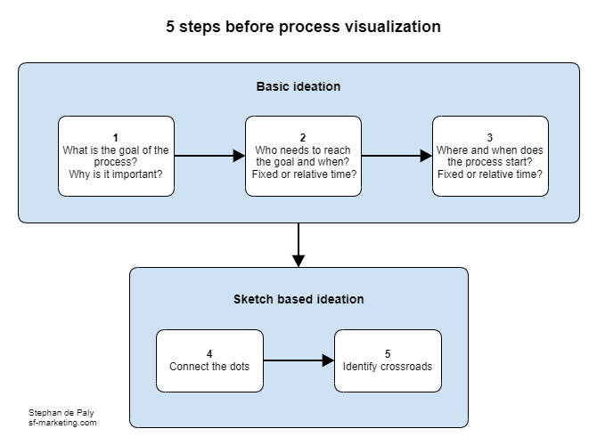
- Get an idea of the goal you try to achieve and how you know you’ve been successful
- Identify who needs to reach this goal at which time
- Think about where the process is supposed to begin at which time
- Outline a basic path to get from the starting point to the finish line
- Now think about if there are cross roads on the way that require decisions where to go next or to stop following the road altogether
Start with writing down the basics of points 1 to 3 to set the boundaries of your process. Depending on your situation it can make sense or might even be required to get an approval for those. It assures that you have your aims set on the right target. No one needs a perfectly defined journey if it follows the wrong direction. If you get a written briefing for a journey check that you have the required information about those points. If not, try to get them before you start working on wrong assumptions.
From pencil sketch to process map
Now that you are sure who you are doing this for towards which goal you can start connecting the dots. You can do the first process outline with pen and paper. Sometimes when inspiration hits you like a lightning bolt that’s all you can muster. I’ve done this sort of thing on a small bartender note block with a pen. After the first draft I recommend shifting to digital drawing on an actual computer. As the process becomes more detailed you will often find it necessary to rearrange things which normally is a lot easier when you drag things around with your mouse.
PowerPoint, which most companies have, works quite well as it lets you connect elements with lines and arrows and the connections remain intact as you move them around. There are also some web based tools. At work I most often use with Gliffy because it is directly integrated with Confluence (a documentation wiki tool by Atlassian) and brings along some element libraries that are really useful for creating process charts.
Which brings me to the point what a process visualisation can look like. Well, it can look like a lot but it must help understanding the process. That’s the whole purpose. It should be detailed enough to show what happens along the process but not turn into a wallpaper. If the process is very complex I usually check if I can break it down into sub processes that can be visualized independently to stitch them together in an overview process chart.
Examples
Simple linear process
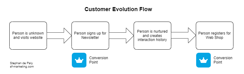
This sort of visualization lends itself to very easy and mostly linear (no detours or loops) processes. Those could be written down as bullet points but human brains like images, which makes a chart faster to take in. It’s a good choice for presentations.
Swimlane diagram
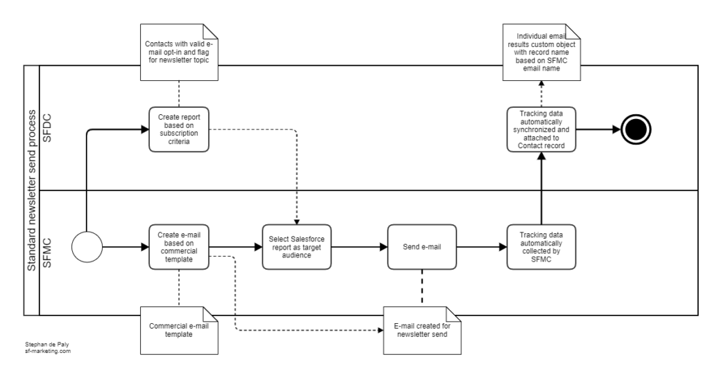
If a process involves two or more systems swimlanes are very helpful to show where the systems need to interact. I use this one very often because in Marketing Automation it’s typical that web frontends, CRM systems, marketing tools and backend systems are involved for every sort of process. It can sometimes be a bit challenging how to sort the swimlanes. One typical approach is to go from frontend to backend. In my charts the middle lanes are usually used for the systems with the most activities
Datastructure-Process Mashup
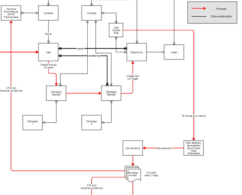
Not sure if something like this exists outside the projects where I introduced it but I made good experiences with this combination as it helps to understand how data structures and data architecture determine or drive process design and vice versa. To make it work and interpret it a basic understanding of entity relationships is required. Those express how data objects relate to each other. Even though it sometimes becomes documentation after a project I mostly use this in earlier project stages when I need something visual to support my own creative process. The creation of this sort of chart forces me to think about the data structures and how those can or cannot be used for a process.
Standardized process diagrams
The examples above do not strictly follow official conventions for business process visualization like BPMN or UML. Those certainly have merit in their precision and avoidance of ambiguity. While they erase potentially dangerous differences of interpretation they are not easy to master. This is true for both creating and reading processes. Students of computer science usually learn to work with those languages.
Don’t worry, be drawing!
Due to my background far outside of computer science I didn’t and neither did about 90% of my target audience. Both aspects contribute to me not really bothering with strict adherence to process modeling languages. It would take me too long to create a process visualization and my customers too long to understand it. We are not in an ideal world and time is a luxury in marketing. My key to still getting the message across is reviews with the audience during we discuss the process. This mostly levels differences in interpretation, often results in important modifications and creates a common ownership of the process idea, which is always a good thing to have in a project team.
To sum things up, those are the three most important lessons of everything I wrote before:
- Visualization helps you reflect your ideas and reveals potential issues. They are almost always worth the invested time and can actually save a project from failure.
- Do not worry too much about aesthetics or strict notation. Simply start sketching and modeling as you see fit. Do it as often as it makes sense. People honor the effort and no one complains about you not being an artist.
- Do reviews with colleagues, your customer or whoever you are creating this for. Reviews create common understanding, reduce risks from different interpretation and generally improve the visualization of a process.
Happy drawing!